
As designers, we often strive for clarity, efficiency, and a frictionless user experience. But what if we could also evoke a powerful emotional response, drawing users into a narrative rather than just presenting information? This is the essence of cinematic UI: moving beyond mere functionality to craft immersive experiences that tell a story, leveraging the evocative power of atmospheric textures and moody visuals.
My journey into this realm began with a fascination for interfaces in film – not just the flashy holographic displays, but the subtle, worn UIs of sci-fi epics or the gritty, tactile screens of a post-apocalyptic world. They often carry a history, a sense of place, and a distinct mood that sterile, flat designs rarely achieve. The good news is, we can translate many of these principles into our digital products, creating interfaces that resonate on a deeper level.
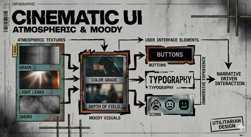
The “Cinematic” Aesthetic: More Than Just Dark Mode
When I talk about cinematic UI, I’m not just suggesting a dark theme. It’s about building an environment. Think about your favorite film. It’s not just the actors or the plot; it’s the lighting, the production design, the soundscape – all working in concert to create a specific emotional tone. In UI, this means intentionally crafting visuals that contribute to an overarching atmosphere, making the user feel something specific: mystery, sophistication, nostalgia, or ruggedness.
This approach moves us away from generic interfaces towards branded, memorable experiences. For web developers and UI/UX designers, this isn’t just about aesthetics; it’s about understanding how to technically achieve these looks while maintaining performance and accessibility.
The Power of Texture: Adding Depth and Narrative
Flat design, while excellent for clarity, often lacks tactility. Textures reintroduce that sense of physical presence. They can tell a story about the interface itself: is it old and weathered? Sleek and futuristic? Organic and natural?
- Gritty & Distressed: Think subtle film grain, paper textures, or brushed metal. These evoke a sense of age, authenticity, or a more analog feel. They can be excellent for narrative-heavy sites or brands wanting a rugged, artisanal identity.
- Subtle Noise & Imperfection: A delicate overlay of digital noise or a slight halftone pattern can break up flat colors, adding an organic, almost ‘alive’ feel without being distracting. It mimics natural imperfections and can soften sharp digital edges.
- Material Textures: Concrete, wood grain, subtle fabric weaves, or polished stone can ground an interface in the physical world. These are fantastic for creating a luxurious, earthy, or industrial aesthetic.
- Technological Glitches: Very subtle scanlines, CRT-like static, or digital interference can create a retro-futuristic or slightly unsettling vibe. Use sparingly to avoid annoyance.
From a technical standpoint, textures need careful handling. High-resolution images can kill performance. We often use WebP or AVIF formats for backgrounds, or even SVG patterns for simpler, scalable textures. CSS properties like background-blend-mode and filter (e.g., blur(), saturate()) allow us to manipulate and layer textures non-destructively, optimizing their impact without hefty file sizes.
Crafting Mood with Color and Light
Color is perhaps the most direct route to emotion. Moody visuals often lean on specific palettes and lighting techniques:
- Desaturated Palettes: Reducing saturation can instantly create a more serious, dramatic, or nostalgic tone. It allows form and texture to come forward.
- Analogous Colors & Limited Hues: Sticking to a narrow range of colors (e.g., blues, greens, and muted purples) creates harmony and a cohesive mood, similar to a film’s color grading.
- Strategic Dark Themes: Beyond just eye comfort, a dark background provides a canvas for dramatic lighting. Use deep, rich blacks or dark grays, not pure black, to allow for subtle gradients and shadows.
- Lighting as Emphasis:
- Subtle Gradients: Instead of flat fills, use radial or linear gradients to mimic light sources. A faint gradient emanating from a focal point can guide the eye.
- Glows & Halos: Gentle glows around interactive elements or text can suggest importance, a futuristic energy, or a soft light source in a dark environment. CSS
box-shadowwith spread and blur is your friend here. - Vignettes: A soft darkening around the edges can focus attention towards the center, similar to a camera lens effect, adding a classic cinematic touch. This can be achieved with a radial gradient as an overlay.
For developers, CSS custom properties (variables) are invaluable for managing these complex color schemes and light values, making theme changes and consistency much easier. mix-blend-mode and backdrop-filter also open up incredible possibilities for layering and interactive lighting effects.
Typography’s Narrative Voice
Typefaces carry their own inherent mood. In a cinematic UI, typography isn’t just about readability; it’s about personality.
- Serifs for Gravitas: Traditional serif fonts can convey history, classicism, or a touch of elegance. Distressed serifs can feel ancient or rugged.
- Sans-Serifs for Modernity/Futurism: Clean sans-serifs can feel sleek and technological. Highly condensed or extended sans-serifs can lean into sci-fi aesthetics.
- Subtle Effects: Avoid overly ornate fonts for body text, but for headings or key elements, consider text effects. A very subtle text-shadow for a soft glow, or a slight textural overlay (achieved with
mask-image) can add significant character. - Readability is Key: Even with moody visuals, contrast must be sufficient. Tools like Stark or browser dev tools can help ensure your text meets WCAG guidelines for accessibility, especially crucial in low-light interfaces.
Motion and Animation for Immersion
Subtle motion is crucial for a living, breathing UI. It adds realism and can guide the user’s eye without being jarring.
- Delicate Transitions: Instead of instant changes, use gentle fades, soft slides, or scale transformations with natural easing curves. This makes interactions feel more tactile and less abrupt.
- Parallax Effects: Used judiciously, parallax on background elements can add a profound sense of depth, mimicking the multi-plane effect often seen in 2D animation and film title sequences.
- Subtle Micro-Interactions: A gentle pulse on an unread notification, a hover state that subtly shifts an element’s lighting – these small touches make the interface feel responsive and alive.
When implementing, prioritize CSS transitions and animations over JavaScript for performance, where possible. Use will-change for performance hints, but always test on various devices.
Implementing Cinematic UI: Technical Considerations
Bringing these concepts to life requires a thoughtful technical approach:
- Optimized Assets:
- Image Formats: Use modern formats like WebP or AVIF for textures. For vector shapes and subtle patterns, SVG is ideal for scalability without quality loss.
- Resolution: Provide appropriate resolutions for different screen densities (e.g., using
srcsetfor background images) or leverage CSS for procedural textures.
- Leveraging CSS Power:
background-image&mask-image: For layering textures and complex shapes.filter: To apply artistic effects like blur, sepia, or saturate directly to elements, which is often more performant than rasterized images.mix-blend-mode: Crucial for overlaying textures, gradients, and subtle lighting effects that interact with the layers beneath.box-shadow&text-shadow: For glows, depth, and atmospheric lighting.linear-gradient&radial-gradient: To create nuanced lighting, vignettes, and color overlays without relying on image files.transform&perspective: For 3D effects and parallax.
- Performance First:
- Minimize DOM Complexity: Fewer elements mean less rendering work.
- Hardware Acceleration: Utilize properties that can be offloaded to the GPU (e.g.,
transform,opacity). - Lazy Loading: For background images or large textural elements that aren’t immediately in the viewport.
- Reduce Motion Option: Always provide an option for users who prefer less animation, respecting their preferences via
@media (prefers-reduced-motion: reduce).
- Accessibility is Non-Negotiable:
- Contrast Ratios: Despite moody aesthetics, ensure sufficient contrast between text and background for readability, especially with textures. Automated tools and manual checks are vital.
- Focus States: Make interactive elements clearly distinguishable when navigated via keyboard.
Balancing Aesthetics with Usability
The biggest pitfall of cinematic UI is letting style overshadow function. An interface can be beautiful and atmospheric, but if users can’t find what they need or interact efficiently, it fails. My advice is always to design for usability first, then layer on the cinematic elements. Start with a clear wireframe, establish information hierarchy, and then introduce mood through texture, color, and lighting.
Test thoroughly. What looks atmospheric on your design screen might be illegible or distracting for a user with different screen settings or under various lighting conditions. User feedback is invaluable for striking that perfect balance.
Conclusion
Designing cinematic UI is an exciting challenge that pushes us beyond conventional practices. It’s about infusing our digital creations with soul and narrative, transforming functional tools into immersive experiences. By thoughtfully integrating atmospheric textures, moody color palettes, expressive typography, and subtle motion, we can craft interfaces that don’t just work, but truly resonate with our users. So, go forth and experiment. Let your UIs tell a story!