
As UI/UX designers and web developers, we’re perpetually striving for pixel-perfect experiences across an ever-growing menagerie of devices. Typography, being the backbone of content readability and visual hierarchy, often becomes a primary battleground in this responsive design war. We’ve all wrestled with font sizes that feel right on a desktop but become microscopic on a phone, or grotesquely oversized on a tablet. The traditional solutions, while functional, have introduced their own set of inconsistencies and headaches.
The Responsive Typography Conundrum: A Legacy of Compromises
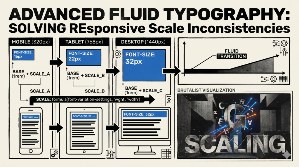
For years, our approach to responsive typography has largely revolved around media queries and relative units like `em` or `rem`. We’d set a base font size, then define breakpoints where we’d explicitly declare new font sizes for headings, body text, and more.
- Fixed Breakpoints: This method creates abrupt jumps in font size. A user resizing their browser window or switching devices might experience a sudden change, rather than a smooth transition. This can be jarring and doesn’t always reflect the natural flow of content.
emandremLimitations: While excellent for maintaining relative sizing within components, `em` and `rem` still scale based on a root font size which itself is often tied to breakpoints. They don’t inherently provide a fluid scale between those breakpoints.- Simple
vwUnits: Using `vw` (viewport width) for font sizes offers fluidity, but it’s a blunt instrument. A font size like `2vw` will scale linearly from min to max viewport, often becoming too small on narrow screens and unreadably huge on ultra-wide monitors without careful `clamp()` or `min()`/`max()` wrappers. This also ignores a crucial aspect: readability generally dictates a certain minimum and maximum size for legibility, regardless of screen width.
These methods lead to inconsistencies in scale and rhythm, forcing us to constantly tweak values and add more breakpoints, complicating our stylesheets and development workflow. It feels like chasing an elusive ideal with a fixed set of tools.
Embracing True Fluidity with CSS Functions
The game-changer lies in modern CSS functions: `clamp()`, `min()`, and `max()`. These functions, particularly `clamp()`, allow us to define a truly fluid range for font sizes (or any other CSS property, for that matter) that scales proportionally with the viewport, but crucially, respects defined minimum and maximum limits.
Understanding clamp() for Fluid Typography
The `clamp()` function takes three arguments: `clamp(MIN, PREFERRED, MAX)`.
MIN: The absolute smallest value the font size should ever be. This ensures readability on the smallest screens.PREFERRED: The ideal value, often expressed using `vw` units or a `calc()` function involving `vw`. This is where the fluidity comes from, allowing the font size to scale dynamically with the viewport.MAX: The absolute largest value the font size should ever be. This prevents text from becoming gargantuan on very large screens, maintaining aesthetic balance and line length.
By defining these boundaries, `clamp()` intelligently scales the font size between your `MIN` and `MAX` values, following the `PREFERRED` value as long as it stays within those bounds. If `PREFERRED` falls below `MIN`, `MIN` is used. If `PREFERRED` exceeds `MAX`, `MAX` is used. This is powerful because it gives us smooth interpolation without the need for additional media queries for font sizes.
Technical Deep Dive: Implementing Advanced Fluid Scaling
Let’s look at a practical example for a main heading (`h1`). Traditionally, you might have something like this:
h1 {
    font-size: 2.5rem; /* Desktop */
}
@media (max-width: 768px) {
    h1 {
        font-size: 2rem; /* Tablet */
    }
}
@media (max-width: 480px) {
    h1 {
        font-size: 1.75rem; /* Mobile */
    }
}
With `clamp()`, we can achieve a much smoother transition with a single declaration:
h1 {
    font-size: clamp(1.75rem, 2vw + 1rem, 3rem);
}
Let’s break down `clamp(1.75rem, 2vw + 1rem, 3rem)`:
MIN(1.75rem): Your `h1` will never be smaller than 1.75rem, ensuring readability on small mobile screens.MAX(3rem): Your `h1` will never exceed 3rem, preventing it from becoming overwhelming on large desktop displays.PREFERRED(2vw + 1rem): This is the magic. The `2vw` part makes the font size scale with the viewport width. The `+ 1rem` provides a stable base, preventing the font from becoming too small too quickly and ensuring a minimum comfortable size even if `2vw` itself becomes very small. This `calc()` expression combines a relative unit (`rem`) with a viewport unit (`vw`), allowing for very precise control over the scaling curve.
The `PREFERRED` value in `clamp()` can be more sophisticated using the `calc()` function to interpolate between two specific pixel (or `rem`/`em`) values over a given viewport range. The common formula for linear interpolation for font size `f` between `f_min` at `v_min` and `f_max` at `v_max` is:
calc( [f_min] + ([f_max] - [f_min]) * ((100vw - [v_min]) / ([v_max] - [v_min])) )
For example, if you want your `h1` to scale from `24px` at `320px` viewport width to `64px` at `1440px` viewport width, you’d use:
h1 {
    font-size: clamp(24px, calc(24px + (64 - 24) * ((100vw - 320px) / (1440 - 320))), 64px);
}
This expression becomes `calc(24px + 40 * ((100vw – 320px) / 1120))` which simplifies to `calc(24px + 3.57vw – 11.43px)` or `calc(12.57px + 3.57vw)`. You’d then use this as your preferred value:
h1 {
    font-size: clamp(24px, calc(12.57px + 3.57vw), 64px);
}
This single line of CSS provides incredible control, eliminating the need for numerous media queries for this specific element.
Benefits for UI/UX Designers and Developers
- Smoother Transitions: No more abrupt jumps. Text scales fluidly and responsively, providing a more refined and natural user experience across all devices.
- Reduced Codebase: Significantly fewer media queries specific to font sizes, leading to cleaner, more maintainable CSS.
- Enhanced Readability: By ensuring minimum and maximum sizes, we guarantee legibility and aesthetic balance, regardless of screen size. We can prevent text from becoming too small on mobiles or overly large on desktops.
- Improved Consistency: Maintains a consistent visual rhythm and hierarchy across the entire design system, simplifying component design and development.
- Greater Creative Freedom: Designers can define typography scales with greater precision, knowing they will be consistently applied.
Best Practices and Considerations
- CSS Variables: Integrate fluid typography into your design system using CSS custom properties. This allows you to define your fluid scaling patterns once and apply them consistently.
:root { --fluid-h1: clamp(24px, calc(12.57px + 3.57vw), 64px); --fluid-body: clamp(1rem, calc(0.8rem + 0.5vw), 1.25rem); } h1 { font-size: var(--fluid-h1); } p { font-size: var(--fluid-body); } - Accessibility: While `clamp()` ensures minimum sizes, always test with user zoom. Users should still be able to zoom text up to 200% without loss of content or functionality, especially if your `max` value is restrictive. Using `rem` for `min` and `max` values allows them to scale with the user’s base font size preference.
- Browser Support: `clamp()`, `min()`, and `max()` are widely supported in all evergreen browsers. For truly ancient browsers (IE11 and below), you might need fallbacks, but for modern web development, you’re in good shape.
- Testing: Diligently test your fluid typography across a range of devices and browser window sizes. Pay attention to how the text behaves at the `MIN` and `MAX` thresholds, and ensure the interpolation feels natural in between.
- Avoid Overuse of `vw` Alone: Remember, `vw` by itself will scale indefinitely. The power of `clamp()` comes from bounding that `vw` scaling, or from using `calc()` to carefully define the interpolation.
Conclusion
Advanced fluid typography, empowered by `clamp()` and `calc()`, represents a significant step forward in our quest for truly responsive and resilient web designs. It frees us from the constraints of fixed breakpoints and inconsistent scaling, offering a powerful, elegant, and maintainable solution to responsive scale inconsistencies. As UI/UX designers, we can craft more harmonious visual hierarchies, and as web developers, we can implement them with greater efficiency and precision. It’s time we moved beyond traditional media queries for font sizing and embraced the inherent fluidity the web was always meant to possess.