For a significant period, the web was meticulously organized. Designers and developers alike found comfort and efficiency in the predictable embrace of minimalist grid systems. These structures, born from print design principles and perfectly suited for the nascent responsive web, dictated a sense of order, cleanliness, and universal usability. But like any dominant paradigm, its ubiquity eventually sparked a counter-movement, leading us towards the rugged, unapologetic aesthetic of brutalist web architecture.
The Grid’s Ubiquity and Its Unintended Consequences
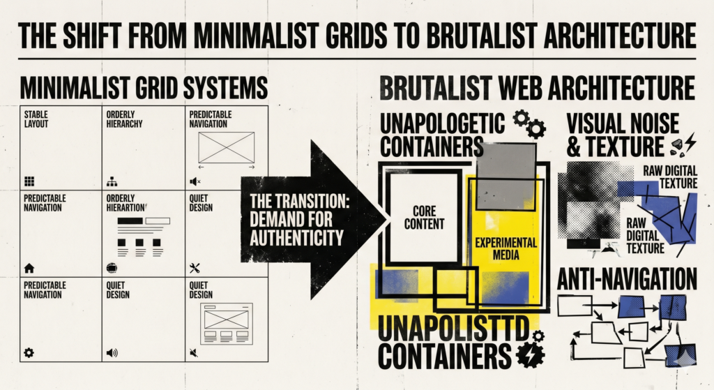
Minimalist grid systems, epitomized by frameworks like Bootstrap, Foundation, and the underlying concepts of CSS Grid and Flexbox, offered a clear path to responsive and aesthetically pleasing layouts. Their core tenets revolved around:
- **Structured Layouts:** Dividing the viewport into rows and columns, providing a logical framework for content placement.
- **Whitespace:** Deliberate use of empty space to enhance readability and visual hierarchy.
- **Consistency:** Establishing uniform spacing, typography, and component styling across a site.
- **Predictability:** Users learned to navigate these layouts instinctively, fostering a sense of familiarity.
- **Responsiveness:** Grids were instrumental in adapting content gracefully across diverse screen sizes.
For developers, grids meant faster development cycles, less bespoke CSS, and a common language for collaborating on complex interfaces. For users, it meant a web that was increasingly easy to navigate, regardless of the device. However, this very success inadvertently led to a certain uniformity. Many websites began to look and feel indistinguishably similar – clean, yes, but often lacking unique character. The pursuit of “best practice” sometimes overshadowed opportunities for genuine creative expression, leading to a landscape that, for some, felt a little too sanitized.
Unveiling Brutalism: From Concrete to Code
Brutalism in architecture emerged in the mid-20th century, characterized by its raw, exposed concrete, massive forms, and a stark functionality. It was a reaction against ornamentation and an honest display of materials and structure. Transposing this philosophy to the web, brutalist web architecture shares a similar spirit:
- **Rawness and Authenticity:** A rejection of sleek, polished interfaces in favor of a more unrefined, unfiltered aesthetic.
- **Functionalism Over Decoration:** Emphasis on content and functionality, stripping away superfluous design elements.
- **Exposed Structure:** Often showcasing default browser styles, unstyled links, and a deliberate disregard for conventional beauty.
- **Bold and Unapologetic:** Utilizing stark typography, contrasting colors (often monochrome), large images, and sometimes deliberately “broken” or unconventional layouts.
- **Anti-Aesthetics:** Embracing elements that might traditionally be considered ugly or difficult, but with purposeful intent.
It’s crucial to understand that brutalist web design isn’t about laziness or poor design; it’s a deliberate aesthetic choice. It challenges user expectations and seeks to provoke a reaction, prioritizing a unique voice over universal appeal.
The Driving Force Behind the Shift
Several factors have contributed to the rise of brutalist web architecture:
- **Rebellion Against Homogeneity:** Designers grew tired of the “bootstrap look” and sought to differentiate their work, creating experiences that stand out in a crowded digital space.
- **Emphasis on Content:** By stripping away extraneous design, brutalism forces the user’s attention squarely on the core message or data, highlighting the authenticity of the information.
- **Technological Empowerment:** Modern CSS capabilities, particularly advanced Grid and Flexbox layouts, afford developers the power to create highly unconventional and seemingly chaotic structures with precision. Z-index, positioning, and blend modes become tools for deliberate layering and visual disruption.
- **Artistic Expression and Experimentation:** For many, it’s a playground for pushing boundaries, exploring alternative aesthetics, and challenging established UX patterns. It’s an opportunity to embrace imperfection and personality.
- **Cultural Resonance:** In an age saturated with highly polished, curated online personas, there’s a growing appreciation for rawness, honesty, and a departure from the overly commercialized.
Technical and Design Implications for Practitioners
For UI/UX designers and web developers, embracing or even understanding brutalist principles demands a shift in perspective and a mastery of foundational skills.
**For UI/UX Designers:**
- **Purposeful Disruption:** Every unconventional choice – a jarring font, an overlapping image, a lack of clear navigation – must be deliberate and serve a specific purpose. It’s not about making things difficult, but about guiding the user’s eye and conveying a specific mood or message.
- **Information Hierarchy Through Contrast:** With less reliance on subtle visual cues, hierarchy is often established through stark differences in typography, color, and size.
- **User Experience Challenges:** Familiarity is often sacrificed for uniqueness. This means designers must be acutely aware of potential usability hurdles and balance expressiveness with core functionality, especially for sites with complex user flows.
- **Emotional Resonance:** Brutalist design often aims to evoke strong emotions. Understanding the target audience and the desired emotional impact is paramount.
**For Web Developers:**
- **CSS Mastery is Non-Negotiable:** Achieving brutalist aesthetics often involves a deep understanding of advanced CSS properties:
- `grid-template-areas`, `grid-gap`, `grid-auto-flow` for breaking traditional grids.
- `position: absolute/relative/fixed`, `z-index` for layering and overlapping elements.
- `mix-blend-mode` for striking visual effects.
- Custom properties (CSS Variables) for managing stark color palettes and typography.
- `@font-face` for loading unique, often bold, typefaces.
- **Semantic HTML Remains Crucial:** While the visual presentation might be unconventional, the underlying HTML structure must remain semantic and accessible. Screen readers and search engines rely on well-structured markup.
- **Accessibility (A11y) Challenges:** Brutalism can sometimes inadvertently compromise accessibility. Low contrast ratios, unconventional navigation patterns, and complex visual hierarchies need careful attention to ensure inclusivity (e.g., using ARIA attributes, providing keyboard navigation, checking contrast with tools).
- **Performance Considerations:** While “raw” can sometimes imply lightweight, brutalist sites often use large images, custom fonts, and complex CSS which can impact load times. Optimization remains key, focusing on efficient image formats, font loading strategies, and lean CSS.
- **Maintainability:** Deliberately complex or “broken” layouts can become a nightmare to maintain if not well-structured and documented. Clear CSS architecture and component-based thinking are vital.
Striking a Balance in the Digital Realm
The shift from minimalist grids to brutalist web architecture is not an either/or proposition, but rather an expansion of our design vocabulary. Minimalist grids still serve as the backbone for countless applications, corporate websites, and e-commerce platforms where clarity, efficiency, and familiarity are paramount. Brutalism, however, provides a powerful tool for artistic expression, brand differentiation, and challenging conventional norms. It’s particularly effective for portfolios, art installations, niche publications, and brands seeking to project a distinct, unapologetic identity.
As designers and developers, our role is to understand the strengths and weaknesses of both approaches. It’s about having the technical prowess to execute complex visions and the design sensibility to know when to embrace order and when to deliberately break it. The web continues to evolve, and with it, our tools and philosophies. The most exciting work often lies not in rigid adherence to any single style, but in the intelligent, purposeful application of diverse architectural principles to craft truly compelling digital experiences.