Building large-scale SharePoint Framework (SPFx) solutions presents a unique set of challenges, especially when it comes to custom theming. What starts as a simple adjustment of colors and fonts can quickly become a complex web of styles, impacting performance, maintainability, and the overall user experience. As someone deeply involved in both UI/UX design and frontend development, I’ve seen firsthand how a well-optimized theming strategy can elevate a project, and conversely, how a poorly implemented one can cripple it. This post dives into practical strategies for optimizing your SPFx custom themes, targeting both designers who define the visual language and developers who bring it to life.
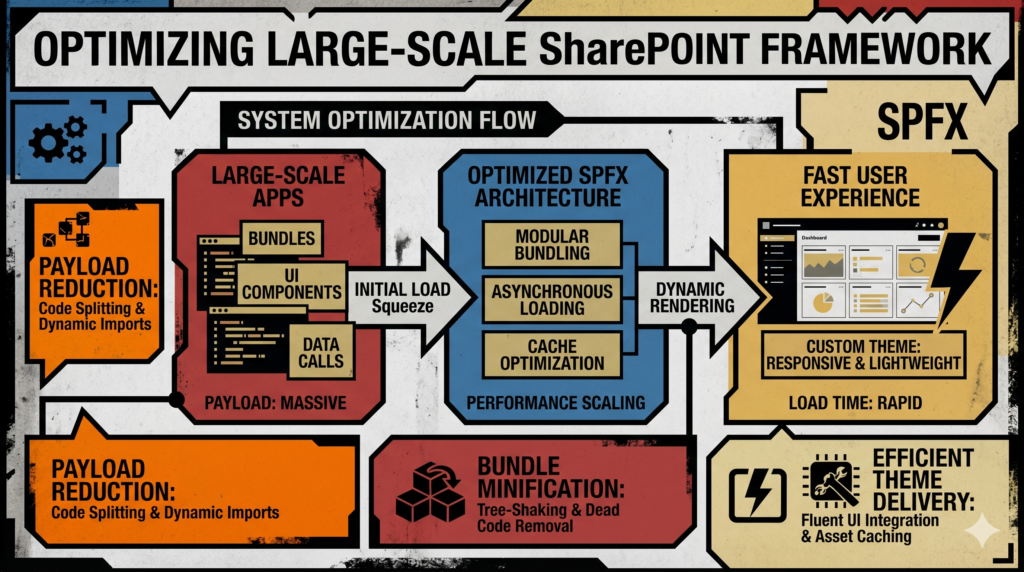
The Theming Landscape in SPFx: A Quick Overview
SPFx leverages Microsoft’s Fluent UI (formerly Office UI Fabric React) for its core components. Fluent UI provides a robust `ThemeProvider` and a `getTheme` utility that allows you to tap into the current SharePoint theme or define your own. When you scaffold an SPFx web part, you’ll typically find SASS files (`.scss`) where you can define styles, often importing Fluent UI’s mixins and variables.
- Fluent UI’s `ThemeProvider`: This React context provider injects theme properties into your components, making them accessible via `useTheme` or `withTheme`. It’s excellent for ensuring consistency across Fluent UI components.
- SASS (`.scss`): Your primary tool for writing styles. It allows for variables, mixins, nesting, and modular organization.
- CSS Custom Properties (Variables): The modern browser standard for defining dynamic, cascade-able variables. These are a game-changer for theming.
While these tools are powerful, their combined use in a large-scale project requires careful consideration to avoid performance bottlenecks and maintenance nightmares.
Core Challenges with Custom Themes at Scale
Before diving into solutions, let’s acknowledge the common pitfalls when custom themes scale:
- Performance Degradation: Overly large CSS bundles, excessive runtime JavaScript for style injection, and frequent DOM repaints/reflows can significantly slow down page load times and user interactions.
- Maintainability & Consistency Issues: Scattered style definitions, deep specificity, and reliance on `!important` flags lead to “CSS roulette.” Updating a single design token can become a multi-file hunt, increasing the risk of visual inconsistencies.
- Scalability Hurdles: Applying a consistent theme across dozens or hundreds of web parts, extensions, and potentially different site collections or tenants demands a robust, centralized approach.
- Developer Experience (DX): Without clear guidelines and a proper structure, developers spend more time fighting styles than building features.
Leveraging Fluent UI & ThemeProvider Strategically
Fluent UI is integral to SPFx, and we must work with it, not against it.
- Understand `ThemeProvider`’s Scope: It’s fantastic for providing theme context to Fluent UI components within your web part. For global, page-level theming, relying solely on `ThemeProvider` can be heavy, as it often involves JavaScript-driven style injection.
- Use `getTheme` Wisely: When you need to read specific theme properties (like primary colors, font sizes) that are defined in the SharePoint theme or overridden by your custom theme, `getTheme` is your friend. Pass these values down as props or use them in conjunction with CSS variables.
- Minimize `mergeStyles` for Theming: While `mergeStyles` (from `@fluentui/merge-styles`) is powerful for atomic CSS and performance in specific scenarios, injecting many theme-dependent styles at runtime via JavaScript can bloat your bundle and increase repaint costs. Reserve it for dynamic, component-specific styles that truly benefit from its capabilities, not for your core theme definitions.
- Avoid Inline Styles for Theming: This is almost always an anti-pattern for anything beyond one-off, dynamic positioning. It defeats the cascade, makes theming impossible, and is terrible for performance and maintainability.
Efficient CSS Management with SASS & CSS Variables
This is where the magic truly happens for scalable, performant custom themes.
- SASS Variables for Structure: Use SASS variables (`$primaryColor`, `$fontFamilyBase`) for values that are largely static or derived from core theme properties. They are compiled down to static CSS, making your stylesheets readable and organized.
- CSS Custom Properties (Variables) – The True Dynamic Theming Hero:
- Definition: Define your core theme properties as CSS variables at a global scope (e.g., `:root {}` or a high-level container like `#spComponentWrapper {}`).
:root { --app-primary-color: #ff6210; --app-secondary-color: #333; --app-text-color: #444; --app-spacing-m: 16px; --app-font-family: "Segoe UI", "Helvetica Neue", sans-serif; } - Consumption: Consume these variables directly in your SASS files using `var(–app-primary-color)`.
.myCustomButton { background-color: var(--app-primary-color); color: var(--app-text-color); padding: var(--app-spacing-m); font-family: var(--app-font-family); } - Benefits:
- Runtime Theming: You can change these variables dynamically at runtime (e.g., via JavaScript) without re-rendering components or re-injecting entire stylesheets. The browser re-renders only what’s necessary.
- Reduced Bundle Size: Less JavaScript is needed to manage styles.
- Cascading Power: They participate in the CSS cascade, allowing for easy overrides within specific scopes.
- Developer Friendliness: Easier to inspect and debug in browser dev tools.
- Definition: Define your core theme properties as CSS variables at a global scope (e.g., `:root {}` or a high-level container like `#spComponentWrapper {}`).
- Modular CSS/SASS: Break down your SASS into logical, small files (e.g., `_variables.scss`, `_mixins.scss`, `_buttons.scss`, `_typography.scss`). Import them into your main stylesheet. Consider methodologies like BEM (Block, Element, Modifier) for naming conventions to enforce clarity and prevent style collisions.
- Critical CSS: For styles that are absolutely essential for the initial render of your web part, ensure they are part of your main compiled CSS bundle, not something loaded late or injected via JS. CSS variables help here by shifting much of the “dynamic” work to the browser’s native CSS engine.
Structuring Your Theme for Scalability and Maintainability
A well-thought-out structure is crucial for managing themes across a large portfolio of SPFx solutions.
- Centralized Theme Definition (Design Tokens):
- Define all your design tokens (colors, fonts, spacing, shadows, border-radii) in a single, shared location. This could be a shared library component, a central SASS partial, or even a JSON file processed by a build script to generate both SASS and CSS variables.
- This “single source of truth” ensures consistency and simplifies updates. If the primary brand color changes, you update it in one place, and it propagates everywhere.
- Shared Library Components (if applicable): If you have a custom component library built with SPFx, ensure it consumes your centralized theme definitions. This way, all your bespoke components automatically adhere to the theme.
- Managing Theme Overrides:
- Global Overrides: If you need to completely override SharePoint’s default styling, inject your custom CSS file at the application customizer level. This is where your global CSS variables should be defined.
- Component-Specific Overrides: Within a web part or extension, scope your custom styles to your component’s root element to prevent unintended global side effects. This is where your CSS variables shine, as you can redefine them locally to create component-specific variations without breaking the global theme.
- Version Control & CI/CD for Themes: Treat your theme definition files like any other piece of code. Version control them, include them in your CI/CD pipelines, and ensure updates are deployed consistently across environments.
Testing and Monitoring Theme Performance
Optimization is an ongoing process. You need to measure and verify your efforts.
- Browser Developer Tools:
- Lighthouse: Run audits to get comprehensive performance scores, including FCP (First Contentful Paint) and LCP (Largest Contentful Paint), which are heavily influenced by CSS loading.
- Performance Tab: Analyze repaint and reflow costs. Watch for long script execution times related to style injection.
- Coverage Tab: Identify unused CSS. Large CSS bundles often contain a lot of dead code.
- Bundle Analyzer Tools: Use webpack-bundle-analyzer (or similar) to visualize the size of your JavaScript and CSS bundles. Look for unexpected bloat.
- User Feedback: Ultimately, the user experience is paramount. Gather feedback on perceived performance and responsiveness.
In conclusion, optimizing large-scale SPFx custom themes isn’t about finding a single magic bullet. It’s about a thoughtful, multi-faceted approach that prioritizes performance, maintainability, and scalability from the outset. By strategically combining Fluent UI’s capabilities with the power of SASS and, critically, embracing CSS custom properties as your primary tool for dynamic theming, you can craft robust, beautiful, and performant solutions that truly stand the test of time in complex SharePoint environments. As developers and designers, our goal is to deliver not just functionality, but an exceptional experience, and theme optimization is a significant step towards achieving that.