For years, as UI/UX designers and front-end developers, we’ve wrestled with responsive design, often feeling like we’re fighting against the very tools meant to help us. Our go-to, `viewport` media queries, have served us well for page-level layouts, but they’ve always fallen short when it comes to the intricate dance of components within varying contexts. That struggle to make a component truly adapt, not just to the screen size, but to its immediate parent container, has been a significant hurdle. This is where CSS Container Queries step in, offering a long-awaited and transformative solution.
The Limitations of Viewport Media Queries
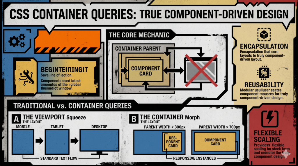
Think about a typical card component. It might display a title, an image, and some text. On a large desktop screen, it could be wide. On a mobile screen, it shrinks. Standard media queries handle this by saying, “if the *viewport* is less than 768px, then do X.”
But what happens when that same card is placed in a narrow sidebar on a desktop layout? Or in a wide main content area? A viewport media query won’t help here. The card will either break its layout trying to fit into the sidebar, or waste space in the wide area, because it’s still responding to the *overall screen size*, not the available space of its *parent*. This leads to:
- Duplicated CSS for component variations.
- Overly complex selector chains to target components in specific layout contexts.
- Components that aren’t truly portable or reusable across different layouts.
- A disconnect between design intent (component should adapt) and development reality (it only adapts to the viewport).
Enter Container Queries: A New Paradigm for Responsiveness
Container Queries fundamentally shift our perspective. Instead of asking “How big is the browser window?”, we can now ask “How big is *my parent*?”. This seemingly simple change unlocks genuine component-driven responsiveness. A component can now inquire about the available space within its direct containing element and adjust its internal layout accordingly, entirely independent of the viewport or other elements on the page.
This is huge for creating resilient design systems and truly encapsulated components.
The Core Mechanics: `container-type` and `container-name`
To use a container query, you first need to establish an element as a “container.” This is done using the `container-type` and optionally `container-name` properties.
- `container-type`: Defines what properties of the container element can be queried.
size: Allows querying both `inline-size` (width) and `block-size` (height).inline-size: Allows querying only the `inline-size` (width) of the container. This is the most common and often recommended value, as querying height can lead to layout issues with intrinsically sized content.normal: The element is not a query container for any properties, but its descendants can still query it if it’s explicitly named and set as a container.
- `container-name` (Optional, but recommended): Assigns a name to your container. This becomes incredibly useful when you have nested containers or want to explicitly target a specific ancestor. Without a name, a query applies to the nearest ancestor container.
Here’s how you declare a container:
<div class="parent-container">
    <div class="my-card">...</div>
</div>
.parent-container {
    container-type: inline-size; /* We want to query its width */
    container-name: card-wrapper; /* Give it a logical name */
    display: grid; /* Or flex, or block */
    grid-template-columns: repeat(auto-fit, minmax(250px, 1fr));
    gap: 1rem;
}
Crafting Responsive Components with `@container`
Once you’ve declared a container, you can then use the `@container` at-rule within its descendants to apply styles based on that container’s dimensions.
The syntax is similar to `@media` queries:
@container (<query condition>) {
    /* Styles to apply when the condition is met */
}
Or, if you named your container:
@container <container-name> (<query condition>) {
    /* Styles to apply when the condition is met for 'container-name' */
}
Let’s revisit our card example:
.my-card {
    display: flex;
    flex-direction: row; /* Default layout: image next to text */
    gap: 1rem;
    padding: 1rem;
    border: 1px solid #eee;
    background-color: #fff;
    box-shadow: 0 2px 5px rgba(0,0,0,0.1);
}

.my-card img {
    width: 100px;
    height: 100px;
    object-fit: cover;
    flex-shrink: 0;
}

.my-card-content {
    flex-grow: 1;
}

/* Now, use a container query to adapt the card's internal layout */
@container card-wrapper (max-width: 400px) {
    .my-card {
        flex-direction: column; /* Stack image and text if container is narrow */
        text-align: center;
    }
    .my-card img {
        width: 100%;
        max-width: 200px; /* Constrain image width even when stacked */
        height: auto;
        margin: 0 auto 0.5rem;
    }
}
In this example, the card’s layout changes from a horizontal arrangement to a vertical stack *only when its parent container named `card-wrapper` is 400px or less wide*. It doesn’t care about the viewport; it only cares about its immediate context. This is the power we’ve been craving!
Practical Applications and Real-World Scenarios
The implications of container queries are vast and exciting for both design and development workflows.
- Dynamic Layouts: Components in sidebars, main content areas, or even footers can intelligently rearrange themselves based on the available space, eliminating the need for context-specific component variations.
- Widgets and Embedded Content: Imagine a weather widget that can be placed anywhere on a page. With CQs, it can decide to show a detailed 5-day forecast when wide, or just the current temperature when narrow, without any JavaScript or complex media query logic.
- Nested Components: A component containing other components (e.g., a complex data table with filters) can now ensure its internal children remain legible and usable, regardless of how deeply nested or constrained its own parent is.
- Design Systems Evolution: Container queries enable truly “atomic” components. A button, a form input, or a card can come with its own internal responsiveness, making it profoundly more portable and robust across any design system implementation.
Container Queries vs. Media Queries: A Clear Distinction
This isn’t an “either/or” situation. Container queries complement, rather than replace, viewport media queries.
- Viewport Media Queries (`@media`): Best for global page layout and adapting the overall structure of your website based on the screen size. Think about changing a single-column layout to a multi-column layout, or hiding/showing global navigation.
- Container Queries (`@container`): Ideal for intrinsic component responsiveness. They allow components to manage their internal layouts based on the space *they* have been given by their parent, making them self-sufficient and context-aware.
A good rule of thumb: Use `@media` for major page layout shifts. Use `@container` for internal component adaptations.
The Impact on Design Systems
For those of us working with or building design systems, container queries are a game-changer. They promise a future where:
- True Component Encapsulation: Components become genuinely independent. Their internal responsiveness travels with them, no matter where they are instantiated.
- Reduced Complexity: Designers can define component behaviors once, and developers can implement them without resorting to countless modifiers or context-specific CSS overrides.
- Improved Maintainability: Changes to a component’s internal layout no longer ripple out to impact global styles or require adjustments across multiple media query breakpoints.
- Better Collaboration: Designers can clearly specify how a component should behave in narrow vs. wide contexts, and developers can implement that behavior directly within the component’s CSS.
Browser Support and Progressive Enhancement
Container Queries have seen rapid adoption! Modern browsers like Chrome, Edge, Firefox, and Safari all support them natively. This means you can start integrating them into your projects today.
For older browsers, you can use `@supports` to provide fallback styles:
/* Default styles for browsers that don't support container queries */
.my-card {
    flex-direction: row;
}

@supports (container-type: inline-size) {
    /* Styles that leverage container queries */
    .parent-container {
        container-type: inline-size;
        container-name: card-wrapper;
    }

    @container card-wrapper (max-width: 400px) {
        .my-card {
            flex-direction: column;
        }
    }
}
This ensures a graceful degradation, where the component still functions, albeit with a less ideal layout, in unsupported environments.
Best Practices for Adoption
- Start Small: Don’t refactor your entire codebase overnight. Identify a few key components that struggle with contextual responsiveness and apply container queries there first.
- Sensible Naming: Use descriptive `container-name` values (e.g., `product-card-container`, `sidebar-widget-area`) to make your queries clear and maintainable.
- Prioritize `inline-size`: Querying `inline-size` (width) is generally safer and more predictable than `block-size` (height), which can sometimes lead to infinite loops or unexpected behavior due to content affecting the container’s height.
- Educate Your Team: This is a new way of thinking about responsiveness. Spend time with your design and development teams to explain the benefits and workflow changes.
Conclusion
Container queries represent a monumental leap forward in front-end development. They finally provide the missing piece of the responsive puzzle, empowering us to build truly robust, flexible, and scalable component-driven designs. By allowing components to be aware of their own allocated space, we’re not just making UIs more adaptable; we’re fundamentally improving our development workflows, fostering better design system architecture, and ultimately creating more delightful user experiences. It’s time to embrace this new era of granular responsiveness.