As a developer and design enthusiast navigating the evolving landscape of UI development, I’ve spent a fair bit of time wrestling with the balance between speed and scalability. Low-code platforms promise rapid development, but without a thoughtful approach, they can quickly lead to sprawling, unmanageable UIs. The key to taming this beast and truly unlocking efficiency lies in a robust reusable component architecture. Let’s dive into how we can build just that, even within the confines — and advantages — of low-code environments.
Why Reusability is Paramount in Low-Code
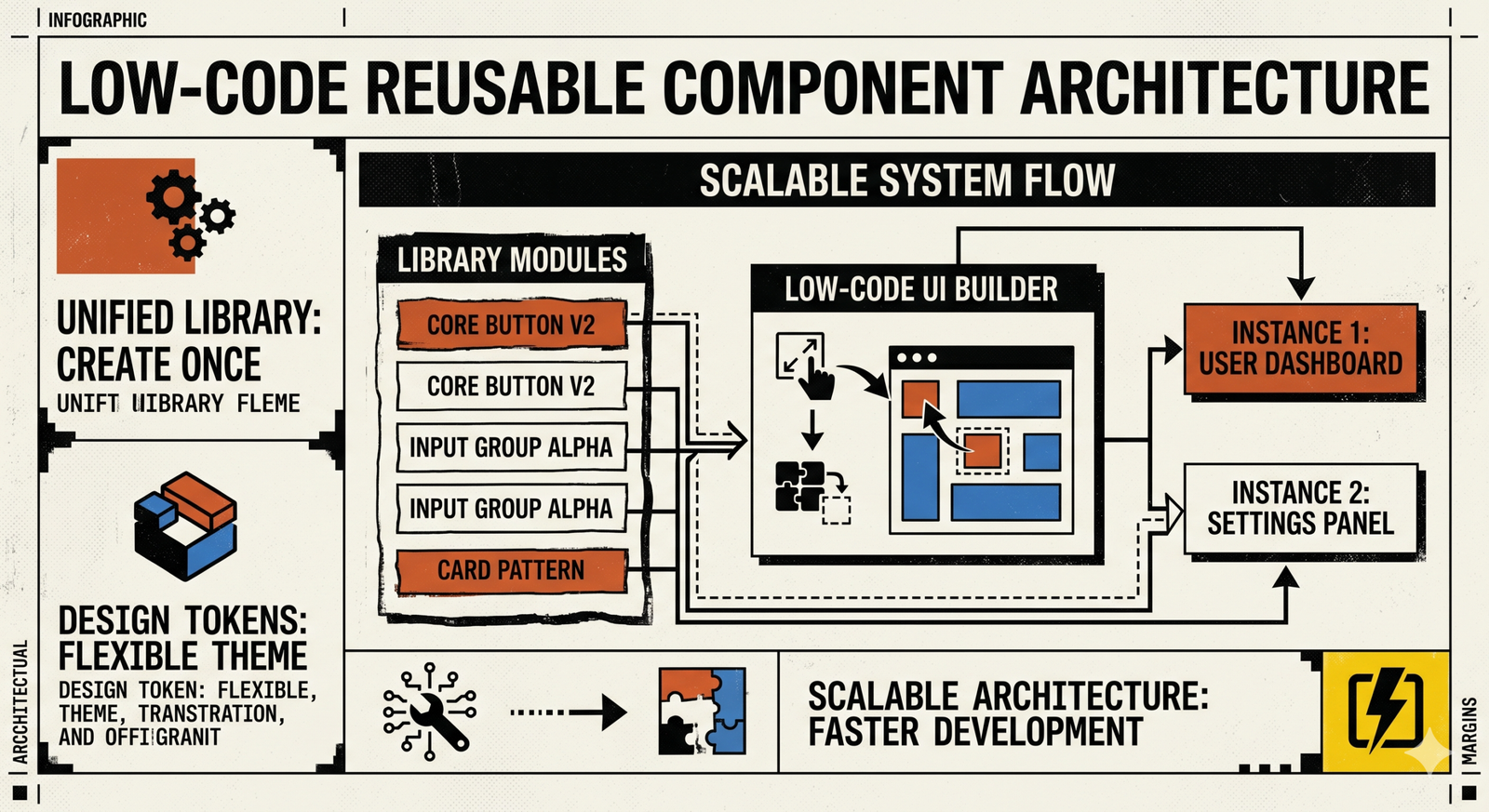
The appeal of low-code is clear: visual development, drag-and-drop interfaces, and accelerated time-to-market. However, the ease of duplication can be a double-edged sword. Without reusable components, minor UI changes become monumental tasks, consistency breaks down, and maintainability plummets.
- Consistency: Ensures a unified user experience and brand identity across your applications.
- Speed: Drastically reduces development time by building once and deploying many times.
- Maintainability: Updates and bug fixes are centralized, propagating changes effortlessly.
- Scalability: Supports growth without proportional increases in development effort.
- Collaboration: Provides a common language and toolkit for designers and developers.
Understanding Components in a Low-Code Context
In traditional web development, a component is a self-contained piece of UI (e.g., a React component, a Vue component). In low-code, this definition adapts slightly based on the platform.
- Pre-built Widgets: The basic building blocks provided by the platform (buttons, input fields, tables).
- Customizable Blocks/Templates: Aggregations of pre-built widgets, often with configurable properties, saved as reusable units (e.g., a ‘Header’ block with logo and navigation).
- Custom Code Components: Many advanced low-code platforms allow developers to inject custom HTML, CSS, or JavaScript, essentially creating bespoke components that can be used alongside native ones. This is where true extensibility shines.
Our focus will largely be on the latter two: how to design and manage customizable blocks and custom code components for maximum reusability.
Core Principles of Reusable Component Design
Before you even drag your first widget, consider these foundational principles.
- Modularity: Each component should be self-contained and responsible for a single piece of functionality or UI. Avoid creating “god components” that do too much.
- Configurability (Parameterization): Design components to be highly configurable. Instead of building five slightly different button components, build one button component with parameters for color, size, text, and icon. Think of these as “props” or “attributes” in a low-code setting.
- Encapsulation: The internal workings of a component should be hidden from its consumers. Users of the component only need to know how to interact with its exposed properties and events, not its internal logic or styling.
- Clear Naming Conventions: Crucial for discoverability and understanding. A component named
BtnPrimaryis far less useful thanButtonwith avariant='primary'property. - Documentation: Even in a visual environment, clear documentation (what it does, its parameters, examples) for your custom components is invaluable for both designers and developers.
Strategic Steps for Building Reusable Components
1. Identify Common UI Patterns
Start by auditing your existing designs or planned layouts. What UI elements appear repeatedly?
- Buttons (primary, secondary, danger, ghost)
- Input fields (text, number, date, dropdowns)
- Cards (product cards, article previews, user profiles)
- Headers and Footers
- Navigation menus
- Modals and Dialogs
- Data tables
- Notification banners/toasts
These are your prime candidates for componentization.
2. Design for Configuration, Not Duplication
This is perhaps the most critical mindset shift. When you identify a common pattern, don’t recreate it each time. Instead, abstract its varying properties.
- Example: A ‘Card’ Component. Instead of a ‘ProductCard’ and an ‘ArticleCard’, create a generic ‘Card’ component. Its configurable properties might include:
imageURLtitledescription(orchildrenfor more complex content)buttonTextonButtonClick(event handler)variant(e.g., ‘elevated’, ‘outlined’)
Leverage your low-code platform’s parameterization capabilities. This might involve setting custom attributes, defining component-specific fields in a properties panel, or even using data models to drive content.
3. Leverage Low-Code Platform Features Strategically
Every low-code platform offers different levels of extensibility. Understanding yours is key.
- Component Libraries/Galleries: Most platforms have a way to save and categorize custom components. Use this feature diligently. Establish a clear hierarchy and tagging system.
- Custom Component Creation: For highly unique or complex UI elements, you might need to drop down to custom code. If your platform supports embedding HTML, CSS, or JavaScript, encapsulate your component here. For instance, you might write a small custom JavaScript widget that then becomes available as a drag-and-drop element. This allows you to integrate advanced logic or third-party libraries.
- Theming & Styling Systems: Centralize your styling. If your platform has a design system integration, token management, or global CSS injection capabilities, use them. This ensures that a component’s visual style can be globally updated without touching individual instances. For example, define primary color once, and all components using it update automatically.
- Data Binding & Event Handling: Components are rarely static. Ensure your reusable components expose clear input properties for data and output events for interactions. A ‘User Profile Card’ component might take a
userIdas input, fetch data internally (if permissible), and expose anonEditevent.
4. Version Control & Management (Low-Code Style)
This is often overlooked in low-code but is critical. While you might not have Git for your visual components, you need a strategy.
- Platform Versioning: Some advanced low-code platforms offer rudimentary versioning for applications or custom components. Leverage these features if available.
- Manual Tracking & Documentation: For simpler platforms, maintain an external changelog for your custom reusable components. Document what changed, why, and how it impacts existing uses.
- Component Owner: Designate an individual or small team responsible for the governance and evolution of the shared component library. This prevents fragmentation and ensures quality.
- Deprecation Strategy: When a component needs to be updated in a breaking way, communicate it clearly and provide a migration path or a “legacy” version for a transition period.
5. Testing for Reusability and Robustness
A reusable component isn’t truly reusable until it’s proven to work reliably across different contexts.
- Contextual Testing: Place your component in various layouts, with different parent containers, and under diverse data conditions. Does it adapt? Does it break?
- Responsiveness: Test on different screen sizes and orientations. Ensure the component’s internal responsiveness is well-handled.
- Accessibility: Verify that your component adheres to accessibility standards (keyboard navigation, proper semantic HTML if custom coded, ARIA attributes).
- Edge Cases: How does it handle missing data? Extremely long strings? Empty states?
Challenges and Considerations
No strategy is without its hurdles.
- Platform Lock-in: Components built specifically for one low-code platform might not be easily transferable. This is a trade-off for the speed gains.
- Over-generalization vs. Specificity: Finding the right balance. Too generic, and components become hard to configure; too specific, and you lose reusability.
- Performance Implications: Overly complex low-code components or excessive custom code can impact load times. Monitor and optimize.
- Team Collaboration: Ensuring designers and multiple developers adhere to component usage guidelines requires strong communication and clear processes.
Best Practices for Adoption & Governance
Building the components is half the battle; ensuring they are adopted and maintained is the other.
- Create a Central Component Library/Style Guide: This can be a dedicated page within your low-code application, an external document, or even a simple spreadsheet. It should showcase each component, its variants, and how to use it.
- Design System Integration: Align your low-code components with a broader design system. This fosters consistency and helps bridge the gap between design and development.
- Training and Evangelism: Educate your team on the available components and the philosophy behind them. Show them the benefits.
- Feedback Loop: Establish a channel for users of the components (other developers, designers) to provide feedback, report bugs, and request enhancements.
- Dedicated Ownership: Assign someone the role of “Component Architect” or “Design System Lead” to oversee the quality, evolution, and documentation of the reusable components.
Wrapping Up
Reusable component architecture in low-code environments isn’t just a “nice-to-have”; it’s fundamental for building scalable, maintainable, and consistent applications at speed. By embracing thoughtful design principles, leveraging platform capabilities, and implementing disciplined governance, you can transform your low-code UI development from a quick sprint into a sustainable, long-distance race. It’s about working smarter, not just faster, and I’ve personally seen how powerful this approach can be.