Understanding High-Contrast Mode
As designers and developers, we often strive for beautiful, nuanced UIs. But what happens when a user’s operating system decides to strip away much of that visual flair in favor of stark contrast? This is the reality of High-Contrast Mode (HCM), a critical accessibility feature primarily used by individuals with low vision, color blindness, or photosensitivity. It’s not just a Windows thing anymore; the underlying principles apply more broadly.
HCM isn’t merely a dark mode or a light mode switch. It’s an OS-level setting that forces specific system colors onto web content, often overriding your carefully crafted CSS. The browser identifies semantic elements like links, buttons, and text, then applies predefined system colors to them. If your component relies solely on color for information or doesn’t use semantic HTML, it’s highly likely to break, rendering critical information or interactions invisible.
Why High-Contrast Matters for Component Libraries
A component library’s strength lies in its consistency and reusability. However, if individual components haven’t been designed with HCM in mind, the library becomes a liability for accessibility. We’re talking about a significant portion of users who might struggle to navigate or understand your product if essential UI elements disappear, lose their meaning, or become unidentifiable in high-contrast settings. It’s not just about compliance; it’s about inclusivity and ensuring everyone can use what we build.
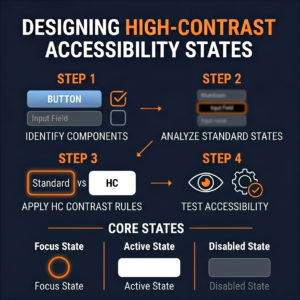
Core Principles for Robust HCM Components
Before diving into code, let’s lay down some fundamental design and development principles:
- Semantic HTML is Non-Negotiable: This is your bedrock. Browsers in HCM rely heavily on semantic elements (e.g.,
<a>for links,<button>for buttons,<input>for form fields). If you’re using a<div>with a click handler instead of a<button>, HCM might not recognize it as an interactive element and won’t apply appropriate system styles, making it invisible or unresponsive. - Don’t Rely on Color Alone: This is an accessibility golden rule, but it’s exceptionally critical for HCM. If the only way to distinguish a “success” message from an “error” message is its green or red background, that distinction vanishes in HCM. Always provide alternative visual cues like icons, text labels, or distinct border styles.
- Focus States are Paramount: In HCM, standard focus outlines can disappear or blend in. Your focus states need to be explicit and robust, often relying on borders or text decoration.
- Testing, Testing, Testing: You simply cannot skip testing your components in actual high-contrast environments.
Technical Strategies: The forced-colors Media Query
The modern, standardized way to address HCM is through the forced-colors media query. This allows you to specifically target and adjust styles when a user has an OS-level forced colors mode active.
@media (forced-colors: active)
Within this media query, you’ll work with system color keywords. These are special values that map to the user’s chosen high-contrast theme colors. Think of them as design tokens provided by the operating system:
Canvas: Background color for content.CanvasText: Foreground color for content.LinkText: Color for hyperlinks.ButtonFace: Background color for buttons.ButtonText: Foreground color for buttons.Highlight: Background color for selected text or active UI elements.HighlightText: Foreground color for text onHighlightbackground.GrayText: Color for disabled or inactive text.
Here’s how we might use it:
/* Example for a custom button */
.my-button {
  background-color: var(--brand-primary);
  color: var(--text-on-primary);
  border: 2px solid transparent; /* Start with transparent or subtle border */
}

@media (forced-colors: active) {
  .my-button {
    background-color: ButtonFace; /* Use system button background */
    color: ButtonText; /* Use system button text color */
    border-color: ButtonText; /* Ensure border is visible, using ButtonText */
  }

  /* Explicitly define focus states */
  .my-button:focus {
    outline: 2px solid Highlight; /* Make focus outline clear */
    box-shadow: none; /* Remove any custom shadows that might disappear */
  }
}
Integrating with Custom Properties (CSS Variables)
This is where things get powerful for component libraries. You can define your default component colors using CSS variables and then override those variables specifically within the @media (forced-colors: active) block.
/* Default component variables */
:root {
  --component-bg: #f0f0f0;
  --component-text: #333;
  --component-border: #ccc;
  --component-link: #007bff;
  --component-focus-outline: #0056b3;
}

/* Base component styles */
.my-card {
  background-color: var(--component-bg);
  color: var(--component-text);
  border: 1px solid var(--component-border);
}

.my-card a {
  color: var(--component-link);
}

.my-card a:focus {
  outline: 2px solid var(--component-focus-outline);
}

/* High-Contrast Mode Overrides */
@media (forced-colors: active) {
  :root {
    --component-bg: Canvas;
    --component-text: CanvasText;
    --component-border: CanvasText; /* Make borders visible */
    --component-link: LinkText;
    --component-focus-outline: Highlight;
  }

  /* You might need specific overrides for elements that don't pick up variables */
  .my-card a {
      text-decoration: underline; /* Ensure links are underlined */
  }
}
This approach allows for centralized management of HCM styles across your library, making it easier to maintain consistency.
Special Considerations for Components
-
- Borders for Visual Cues: Elements that rely on subtle background color differences (e.g., card backgrounds, input fields) can disappear. Give them an explicit border using
CanvasTextorButtonTextin HCM to define their boundaries. - SVG and Icons: Use
currentColorfor SVG fills and strokes where possible. This ensures they inherit the current text color, which will be appropriately set by the OS in HCM. Alternatively, define specific fills/strokes using system colors within the media query.
- Borders for Visual Cues: Elements that rely on subtle background color differences (e.g., card backgrounds, input fields) can disappear. Give them an explicit border using
.my-icon {
  fill: var(--icon-color, currentColor); /* Default to currentColor */
}

@media (forced-colors: active) {
  .my-icon {
    fill: CanvasText; /* Ensure icon is visible against Canvas background */
  }
}- Background Images: Background images are often removed in HCM. If an image conveys essential information (not just decoration), ensure that information is also available via text, an
<img>tag with meaningfulalttext, or alternative visual cues. - Hidden Content: Be extremely cautious with
display: none;orvisibility: hidden;in HCM contexts, as these will naturally remove content. Similarly, avoid making thingsopacity: 0;if they are meant to be visible. - Shadows: Box shadows and text shadows typically disappear in HCM. If a shadow is crucial for distinguishing overlapping elements, consider using a border instead.
Testing Your Components in High-Contrast Mode
This isn’t optional. Here’s how:
- Windows High Contrast Settings: On Windows, go to Settings > Ease of Access > High contrast. Turn it on and try different themes (e.g., “High Contrast #1,” “High Contrast White”).
- Browser Emulation: Modern browsers have developer tools that can emulate
forced-colors: active. In Chrome DevTools, for instance, you can find it under the “Rendering” tab (three dots menu > More tools > Rendering). Look for “Emulate CSS media feature forced-colors.”
Test every interactive state: hover, focus, active, disabled. Test various component types: buttons, links, form inputs, cards, notifications. Ensure information remains accessible and interactions are clear.
Building HCM into Your Design System
For component libraries, HCM needs to be a first-class citizen:
- Design Tokens: Establish design tokens for system colors (e.g.,
--sys-canvas,--sys-canvas-text) that map directly to the system keywords within yourforced-colorsmedia query. This provides a consistent way for designers and developers to refer to these specific HCM values. - Documentation: Clearly document guidelines for HCM within your component library. Explain which properties are affected, best practices for iconography, and how to test.
- Component Examples: Provide live examples of each component rendered in default and high-contrast modes.
Conclusion
Designing for high-contrast accessibility isn’t about compromising aesthetics; it’s about robust, inclusive design. By embracing semantic HTML, avoiding reliance on color alone, and leveraging the forced-colors media query, we can build component libraries that are not just beautiful, but also truly usable for everyone. It requires a thoughtful approach, meticulous testing, and a commitment to integrating accessibility from the ground up, not as an afterthought.